Showing posts with label colors. Show all posts

Friday, June 19, 2015

oops, my neurosis is showing...


Like I told you here, I looove the IG account @averageparentproblems. But the black header & footer that @mommyshorts uses on @averageparentproblems just didn't go with the natural lighting & light color palette with touches of pastel or bright pinks of the @insta2yearold sceenshots in my post. 


So in this post, I'm sharing some of @averageparentproblems' hilarious posts that didn't make the cut in my original blogpost. 


There are other even funnier posts, but I could only bring myself to include those with black accents in the photos to go with the standard black header & footer. 


I couldn't pick posts with natural, diffused lighting because I personally feel they don't go with a black frame.


I picked photos that probably used fluorescent, halogen or incandescent lighting so the shadows go with the black frame (This is probably why @mommyshorts picked that black frame... because these harsh lights are common at home where those average parent problems usually take place... especially since the photos are crowd-sourced). 


Yes, my neurosis is showing again. Gah!

Photos are screenshots of @averageparentproblems' IG posts.

Click here for the of-dots-&-things version of this post. Click here for previous posts from the Oops, My Neurosis Is Showing... series.

Monday, May 11, 2015

oops, my neurosis is showing...


As you might know from here, I've been enjoying my new grown-up's coloring book. But I have to admit that when I started out, it kind of tested my decision-making skills.


After coloring in one part, so many thoughts flooded my head: Which color do I use next? Which warm color do I put beside this cool color? Should I pair it with its complementary color or not? 


With all these decisions, coloring a page took a while. Until I started a ROYGBV color scheme...


Coloring rainbow-style made it easier to choose which color to use next! So I've been obsessed with it.


Gee, I wonder when I'm ever going to finish this non-ROYGBV page now...


Oops, my neurosis is showing again.

Photos are my own and from here.

Click here for the of-dots-&-things version of this post. Click here for previous posts from the Oops, My Neurosis Is Showing... series.

Friday, February 15, 2013

rambling about getting old & not feeling it


I celebrated my birthday 2 weeks ago. Let's just say that I've gotten to that age when I don't automatically remember my age when asked (and I mean asked on a form to be filled out rather than, God forbid, someone actually asking me out loud) how old I am.

Seriously. I have to calculate it just like I do when asked how old my mom or grandmother are: 2013 minus year of birth...

And no, it isn't memory loss from old age yet because I remember my kids' ages perfectly well.

In a few years, I will go back to automatically remembering my age because I will have reached a milestone age. Ironically, I think it is nearing that milestone age that makes me forget my age today. :P

The funny thing is I don't feel old (until I have conversations with friends about cholesterol & SGPT levels). But seriously, I feel like I just graduated from highschool or college. Maybe because I've kept my highschool & college friends and still see them at least once a week. Of course, I realize I didn't just come out of school when I get to talk to the trainees in my old office who actually just graduated (who, by the way, described Leonardo DiCaprio as "middle-aged" in a recent Pinoy Henyo game! Horror!).
But when I paid for our realty tax last month (I used to ask my mom to do this for me), I left city hall like a kid bursting with pride having accomplished something so grown-up. Strange, because I am actually grown up.


I guess age is really relative. And maybe the point of birthdays is not to make me feel old, but to let me celebrate my youth (even in my late 30's). After all, on my birthday, I am younger than I'll ever be.

Photos from acupofjo & lushlee.

Monday, May 28, 2012

hahahappy


Lately, I haven't been inspired to write any posts for this blog. Maybe it's because I'm happy. After all, this blog was meant to be an outlet for when I am down in the dots, -er, dumps.

Maybe I've been post-less because I've been getting more than my usual dose of sunny days...


Of color...


And polka dots...


Even horses...


But it's possible... that I haven't been posting because I'd really rather not push down that post below of the man in a suit who allegedly tweeted me...


Because he's just so incredibly cute.


Okay, I may be going completely insane... Or I could just be insanely hahahappy!

Photos from annnniegirl.

Click on the yellow fonts throughout this post for links to posts you may have missed.

Sunday, May 6, 2012

oops, my neurosis is showing...


This photo filled with lavender could have been part of my of-dots-&-things Color Obsession post on lavender here. But for some reason, I couldn't bring myself to include it. The greens, browns, yellows & nudes were exactly the colors I chose in my lavender color palette. But for some reason, this photo still didn't make the cut.

Am not really sure why. Could it be the huge leopard print? Perhaps they're a tad too big? Maybe I find the model's pose too awkward? Too contrived? Too unreal?

I don't really know. What makes it even more puzzling is that I feel it is pretty enough a picture to post in this blog. Which leads me to my neurosis. I'm not a very good photographer so most of the photos I take myself never make the cut. That's why I have a post on my home makeover here without an actual photo of my house. It wasn't easy to find photos on the web with furniture pieces that resemble mine. But I preferred that over posting photos of the real thing - because they had bad lighting. This is also why I used a screenshot from H&M here to show my shopping loot rather than upload a photo of the actual loot. I even spent some time surfing for a photo of the sleeveless seafoam green top I also purchased but didn't find it. So I opted to just mention that I got one and plan to pair it with my peach shorts. Instead of uploading a photo of the actual outfit.

You see, my blog is my repository of beautiful things. So if I decide to post an ugly photo, I'd probably end up taking it down later anyway. I realize my posts could end up as contrived & unreal as the model above. But while the pretty photos are taken by much better photographers than I am, I promise that every word is genuine and real and all so, so me.

Sigh. My neurosis is showing yet again...

Photo from here.  

Click here for previous posts from the Oops, My Neurosis Is Showing series.

Sunday, April 29, 2012

their Spring, our Summer colors


I admit, it was a relief to see Gwyneth Paltrow on the cover of the Harper's Bazaar Spring 2012 issue in black. Yes, the above is the subscription cover (that, as you know from here, is different from the newsstand cover). And yes, it is the Spring issue.


Very different from the usual colorful Spring issues - like the March 2012 Aussie version here, right?


It was a busy start-of-the-summer at work for me. So trying to avoid black this summer would have been added pressure. Plus, I can always count on black to hide the fat. :) I was going to wear anything I wanted anyway, so it was good to get Gwyneth's nod of approval.

The funny thing is that after I get a license to wear black during the summer, I can't help get drawn to Spring's pastels. You already know how I am obsessed with seafoam green here.


So imagine how kid-in-a-candy-store I felt at H&M during my recent trip to Singapore. I was hoping to score some Marni-H&M returns (see related post here), but that didn't work out. Fortunately, the pastels of the Conscious Collection consoled me (and the environment at the same time).


I ended up buying the printed straight dress below, those peach shorts that I plan to pair with a sheer seafoam green sleeveless top I also got at H&M.


Oh, and how do I hide the fat in these light pastels? Well, like I always say when I gain a few pounds, it's either time to hop on the treadmill or go shopping for bigger clothes. I just did the latter! Problem solved in Spring's pastels! 

Photos from pinkwallpaper, H&M, here, here and here.

Click here for previous posts on fatness.

Tuesday, April 17, 2012

before the monobloc


Do you remember what chairs were used in outdoor school events before the monobloc chair was invented? I remember the curved wood of the chairs during field demonstration events at my school was not polished like this. They looked more like the wood used as broomsticks. Apparently, this wooden chair with a sulihiya seat is called a bendwood or Thonet chair. And I am loving the pop of color in this new Thonet chair!


I also love the contemporary wider & shorter look on these pre-monobloc rental chairs of the past.


Don't they look fabulous at this breakfast table?


I just love how native sulihiya looks so fresh & current!

Photos from designsponge and here.

Click here for previous nostalgic posts.

Sunday, April 8, 2012

easter eggs


I've always wanted to dye eggs for Easter because of the delightful, lovely color options. But I've never gotten around to buying the dyes (what do they use? food coloring? paint?), laying out the newspaper and mixing the dyes to get to the colors I want.


I surfed the web to find out what dye to use and I read about a "kit", which I assume will not be easy to find in Manila since we're not the Easter-Bunny-believing-type-of-folk. I then found out how to dye eggs with food coloring here, but maybe because I am such an undomesticated goddess (see related post here), I felt a bit nauseous at the list of supplies that needed to be gathered and daunted when I got to the part of having to measure & mix vinegar and hot water and food coloring. I don't even know where to get food coloring though I figure I should be able to find some in the baking needs section, a grocery aisle I've stopped visiting since I realized those tiny colored stars and rainbow sprinkles don't really taste like candy. (Okay, I'm starting to feel that you're thinking this is a major dumb blood moment - No, that wasn't a typo because I underwent blood transfusion when I gave birth to Noah and have always felt I got dumber after that. - but you have to understand I don't even know how to fry an egg! And yes, I know some super-moms even tie-dye or marble their easter eggs!).

Luckily, I found out you can actually use Kool-Aid to dye eggs! And as some of you might already know from here, I love Kool-Aid, so we always have some in our kitchen cupboard (no need to make an extra trip to the grocery!). And all you need to do is dissolve the Kool-Aid powder in a cup of water (no vinegar or measuring needed!), and you can go ahead and dip the egg & scoop it out to dry.

Pam (who fully discloses here what worked and what didn't in her Kool-Aid-dyeing experiment) says Lime makes lovely green and Berry, a gorgeous blue. The Orange actually turns out a deep, rich yellow and Strawberry is more orange than red.

I like the idea of excitedly waiting to find out what colors we will get with each flavor. And dyeing eggs in the midst of fruity smells! I think I might just get around to dyeing some eggs this Easter!

Who knows? Maybe next Easter, I can move on to food coloring and create these pretty, pretty colors!


Happy Easter everyone!


Click here for a different kind of Easter.  

Tuesday, April 3, 2012

workday daydream


I wonder if Kobi Yamada would take this back if she knew that this was the kind of life people are imagining...


Who wouldn't love to get paid to drink wine while looking at Pinterest?


I would love to be paid to be one of those ladies-who-lunch! I have to admit that every time I spend a leave at the mall, I am boggled at how there are so many of them. I can't help feel envious that this is what they do - a stark contrast to my typical workday of wall-to-wall meetings (with barely enough time to pee) that end at 6pm so I can finally start my real work.

So sometimes, I daydream about alternative careers: Like being a Lego-brick-builder, the ones who build those giant Lego creations. Or being a Crayola-color-namer. I have been daydreaming about this stylish box of crayons with colors like Tiffany blue, Louboutin red, Mulberry oak, Hermes orange and Chanel black.

What about you? What would you wish someone paid you to do? 

Photos from i'mjustsaying, here via acupofjo and polkadotshoppingbag.

Saturday, March 17, 2012

Today, I am unloving...


Today, I am un-loving... that happy nails make me sad. Because I can't have them.


This photo of purple & yellow-orange nails that I just posted here reminded me of my unfortunate reality. I am allergic to nail polish. My nails turn completely white (like the white ones on the tips of normal nails) and it will take at least 5 months to grow them out.

I noticed that black nail polish has been popping up everywhere. On Eva Mendez and Zooey Deschanel. And in a non-goth way. I haven't really decided if I would be willing to try out this black nails trend. But it doesn't really matter because I can't.


And it really is a shame because I would love to accent a completely neutral outfit with a pop of color on my nails like this!


Today, I am un-loving... that I cannot wear nailpolish.


Click here for previous posts from the Today, I am un-loving... series.

Sunday, September 4, 2011

i just can't mix it up more


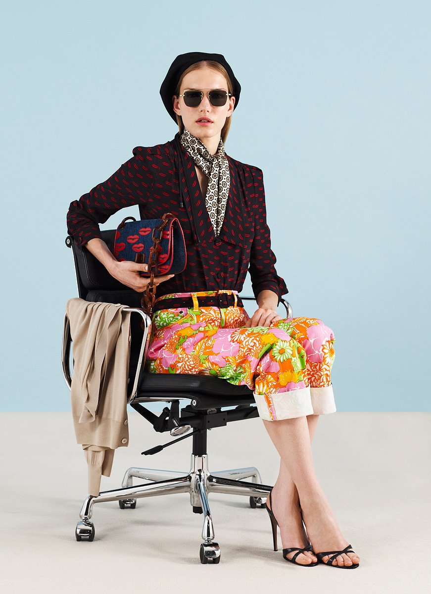
Since I started my main blog ofdotsnthings.blogspot.com, I've pushed myself to mix it up. It wasn't intuitive for me to mix warm colors with cool ones (see post on this here) or to wear prints with other prints (see post on this here). I've successfully resisted my ancient design sensibilities. I can now wear gray with camel, mix my silver watch with gold bangles and bronze bag hardware, even mix prints in the same color palette!

But these ensembles from the Prada Resort 2012 Collection, I am still not ready for. I cannot bring myself to mix hot pink, neon orange & apple green with navy & red.


I cannot even muster up the boldness to mix these pastels with the black & red purse! What about you? Can you mix it up this courageously?

Photos from vogue. 

Click here for a different post on the Prada Resort 2012 Collection.